Outlet Company
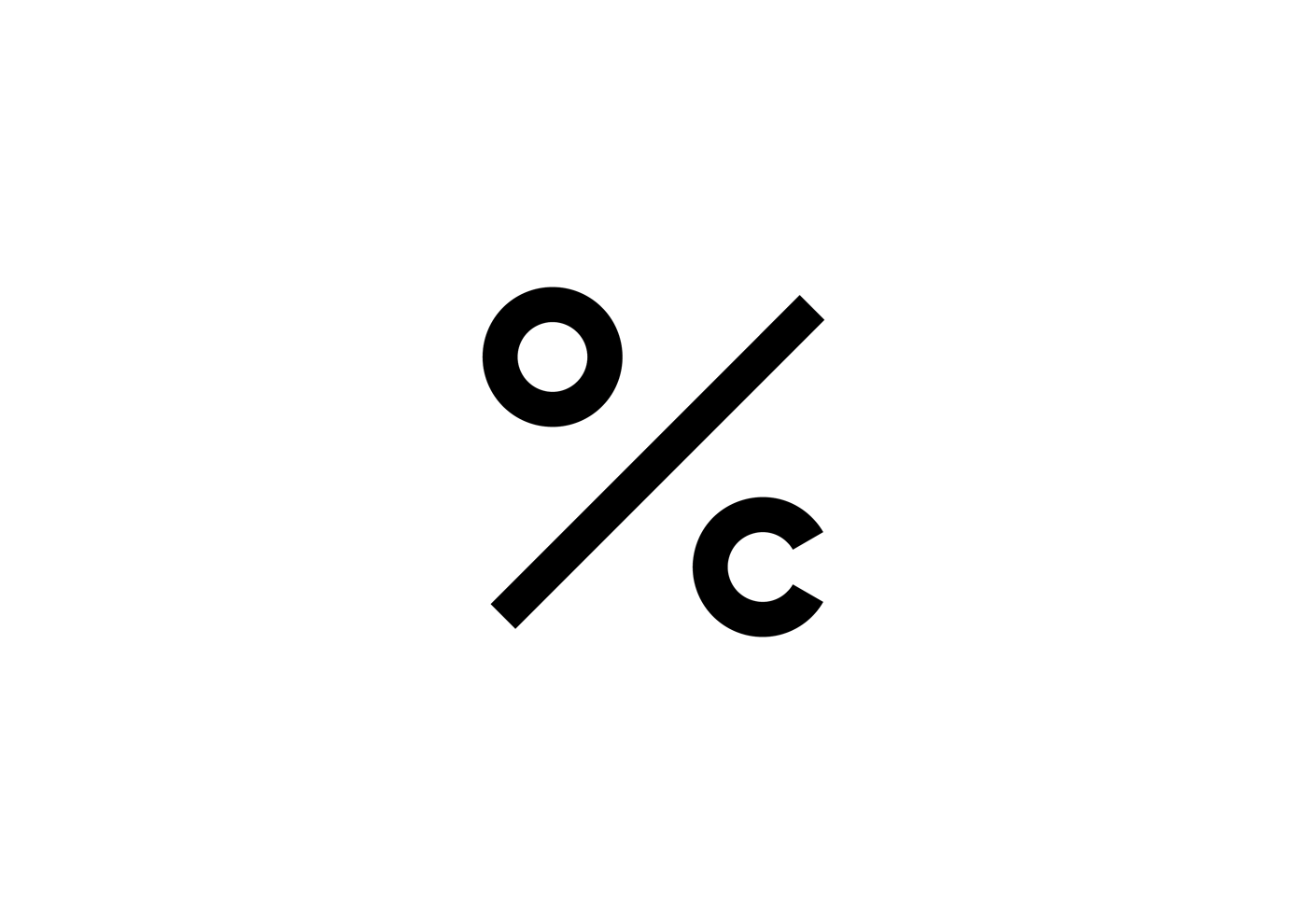
In the financial sense, ‘Outlet Company’ is a company that offers its clients a new, brand product at a lower price than the prices offered by other stores on the market. Thus, the percentage, by which the client can have the goods they are buying discounted, constitutes the essence of the transaction. Therefore, the ‘%’ symbol has become an inspiration for the design of a new company logo, which has resulted in creating a sign that contains the first letters of the company name and is synonymous with the percentage symbol associated with the possibility of saving money.
The objective is to create a flexible system that will work in any building or space, regardless of their scale, plan or character, while maintaining a clear and consistent character of the brand. The architectural and graphic concept results from the idea motivating the design of the logo. As in the case of the company logo, the outlet-type character of sale defines the idea to develop the image of the store. Brand products sold at reduced prices become an inspiration for architectural interpretation. 1/3 of the initial price of the goods is translated into the language of architecture and reflected in the interior with a colorful ‘tub’ reaching up to ~1/3 of the height of the interior undergoing the adaptation. Above this level, the room remains unchanged. Its existing austere character contrasts with the new, smooth, and homogeneous texture of the floor and walls. In this concise fashion, the language of sales is represented in the language of architecture.
The yellow color has been selected as the leading company color as distinctive for marketing purposes and flexible for different functions – it emphasizes the sense of contrast in the existing store locations. The prepared store 'frame' is supplemented with a furniture set and hangers in the same color, designed especially for the purpose. Hefty in its form, the furniture (a counter, fitting room, seat, and mirror) contrasts with the delicate openwork hangers. This allows for preserving the spatial balance. Taking into account the economic aspect, it is assumed that the confectionery off-the-shelf hangers will be purchased and varnished. All the elements of shop equipment are movable, which ensures flexibility of predetermined functional solutions depending on the nature and size of a given store.
The proposed architectural solutions constitute actions carried out in connection with spatial recycling, where the seemingly devalued space acquires a new life. The value and potential of the space is used in the least intrusive manner possible.
The graphic solutions go hand in hand with the architectural ones. The assumed consistency and coherence of the solutions are continued in the corporate visual identity. The elements that represent it are very strongly correlated with the store architecture. The yellow ‘tub’ has a graphic representation in the form of a yellow component which is always 1/3 of the printing sheet. Each element of identification is an integral part of the whole. Architecture becomes an inspiration for the graphics and vice versa.
–
Project: Corporate identity and interior design
Location: Łódź, PL
Status: Commission
Year: 2014
Architects: Tomasz Berezowski, Dyrda Fikus Architekci
Team: Tomasz Berezowski, Marta Dyrda, Radosław Fikus